

The responsive canvas 1 - The width and height property.
The HTML canvas is an important component used to present both dynamic and static content to users. Its methods and properties provide the developer/user a toolkit and environment which text, objects and images that can be drawn are presented.
Like every other HTML element, there is need for it to respond and adjust to the screen resolutions of the various devices on which it would be rendered. Considering block elements like div, responsiveness can be achieved by combining relative sizing like the percentage(%) along with other properties like the HTML flex attribute and the HTML grid in its CSS. These properties can also be applied on the HTML canvas, but with one drawback - CSS would affect only the element as a whole but not any text or image drawn to it. This behavior would cause its content to be scaled by stretching therefore losing quality.
<!DOCTYPE html>
<html lang="en">
  <head>
    <style>
      body {
        display: flex;
      }
      #canvas {
        width: 50%;
      }
      #plantain {
        width: 50%;
        height: auto;
      }
    </style>
  </head>
  <body>
    <img id="plantain" src="./plantain.jpg" alt="plantain" />

    <canvas id="canvas" style="border: 1px solid #d3d3d3"> </canvas>

    <script>
      let draw= function () {
        var canvas = document.getElementById("canvas");
        var ctx = canvas.getContext("2d");
        var img = document.getElementById("plantain");
        // drawing image to match canvas width;
        ctx.drawImage(img, 0, 0, canvas.width, canvas.height);
      };
      window.onload =draw

    </script>
  </body>
</html>
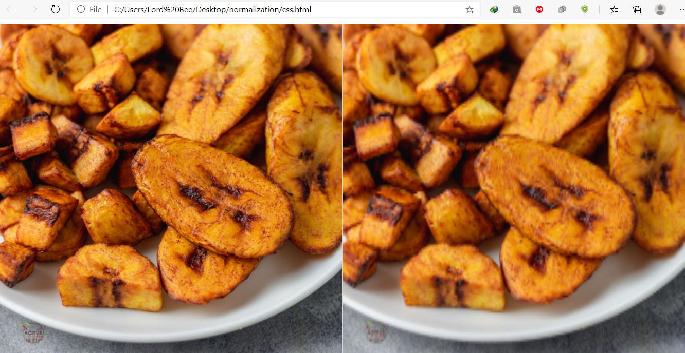
The image on the right is the original image, while the image on the left is the canvas image.
The distortion is apparent. To avoid distortion, set the dimensions of the canvas directly on its width and height properties. How can this be achieved?
Javascript to the rescue
Javascript on the browser has DOM methods with which you can retrieve the width and height of a given container in pixels.
First, we adjust our code a bit
<!DOCTYPE html>
<html lang="en">
  <head>
    <style>
      body {
        display: flex;
      }
      #plantain {
        width: 50%;
        height: auto;
      }
      /* container style set to 50% of the body, it's height is set to auto, and its position is set to relative to give it the same height of the longest element in the same container it is in */
      /* The dimensiton of this container can be set to any value. The dimensions of the canvas would be drawn relative to its container */
      #container{
          width:50%;
          height:auto;
          position:relative;
          /* to provide visual boundaries of the container, a background color has been added */
          background-color: black;
      }
    </style>
  </head>
  <body>
    <img id="plantain" src="./plantain.jpg" alt="plantain" />
    <!--Container to create the canvas in -->
    <div id="container">
        <!-- no width or height property given here -->
        <canvas id="canvas"style="border: 1px solid #d3d3d3"> </canvas>
    </div>


    <script>
      let draw=function () {
        var canvas = document.getElementById("canvas");
        var ctx = canvas.getContext("2d");
        var img = document.getElementById("plantain");
        // drawing image to match canvas width;
        ctx.drawImage(img, 0, 0, canvas.width, canvas.height);
      };
      window.onload = draw
    </script>
  </body>
</html>
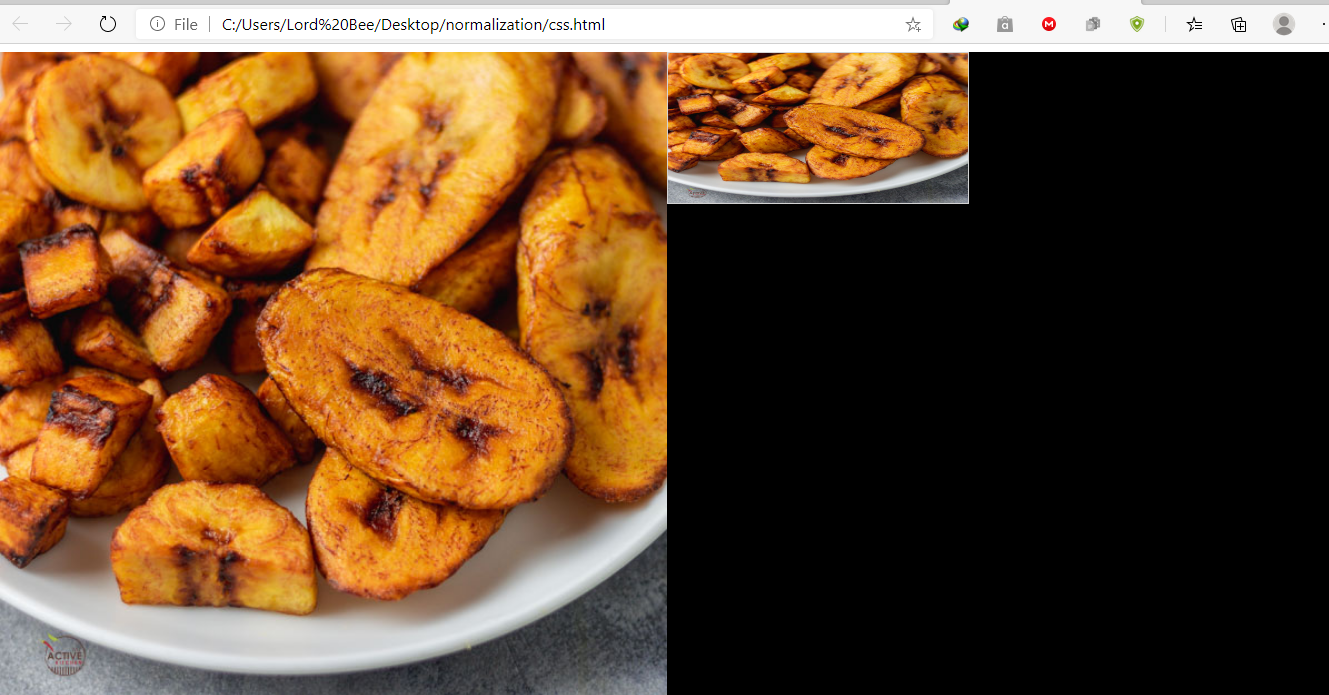
Running this code would render a more distorted canvas as no dimensions have been given.
offsetWidth and offsetHeight properties
These properties return layout width and height of an element when called.
/*adding these lines would provide the dimensions of the container in pixels on which the canvas is to be drawn.*/
let width=document.getElementById('container').offsetWidth;
let height=document.getElementById('container').offsetHeight;
canvas.width=width;
canvas.height=height
<!DOCTYPE html>
<html lang="en">
  <head>
    <style>
      body {
        display: flex;
      }
      #plantain {
        width: 50%;
        height: auto;
      }
      /* container style set to 50% of the body, it's height is set to auto, and its position is set to relative to give it the same height of the longest element in the same container it is in */
      /* The dimensiton of this container can be set to any value. The dimensions of the canvas would be drawn relative to its container */
      #container {
        width: 50%;
        height: auto;
        position: relative;
        /* to provide visual boundaries of the container, a background color has been added */
        background-color: black;
      }
    </style>
  </head>
  <body>
    <img id="plantain" src="./plantain.jpg" alt="plantain" />
    <!--Container to create the canvas in -->
    <div id="container">
      <!-- no width or height property given here -->
      <canvas id="canvas" style="border: 1px solid #d3d3d3"> </canvas>
    </div>

    <script>
        let draw= function () {
        var canvas = document.getElementById("canvas");
        var ctx = canvas.getContext("2d");
        var img = document.getElementById("plantain");
        // Adding dimensions to the canvas.
        let width = document.getElementById("container").offsetWidth;
        let height = document.getElementById("container").offsetHeight;
        canvas.width = width;
        canvas.height = height;
        // drawing image to match canvas width;
        ctx.drawImage(img, 0, 0, canvas.width, canvas.height);
      };
      window.onload = draw;
 // resize the window to monitor responsive
1.
ness;
      window.addEventListener("resize", function () {
            draw();
        });
    </script>
  </body>
</html>
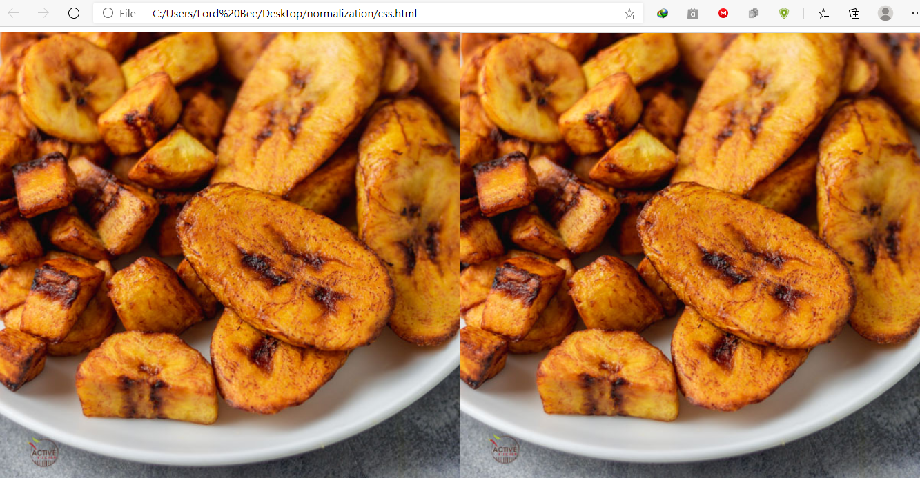
The above code would render a perfectly responsive HTML canvas with the perfect meal drawn perfectly on it.
 I hope this short piece helps someone in their quest for a responsive canvas. This is the easier part of responsive HTML canvas though. I hope to write on the making the contents of the HTML canvas responsive using the normalized coordinate system.


